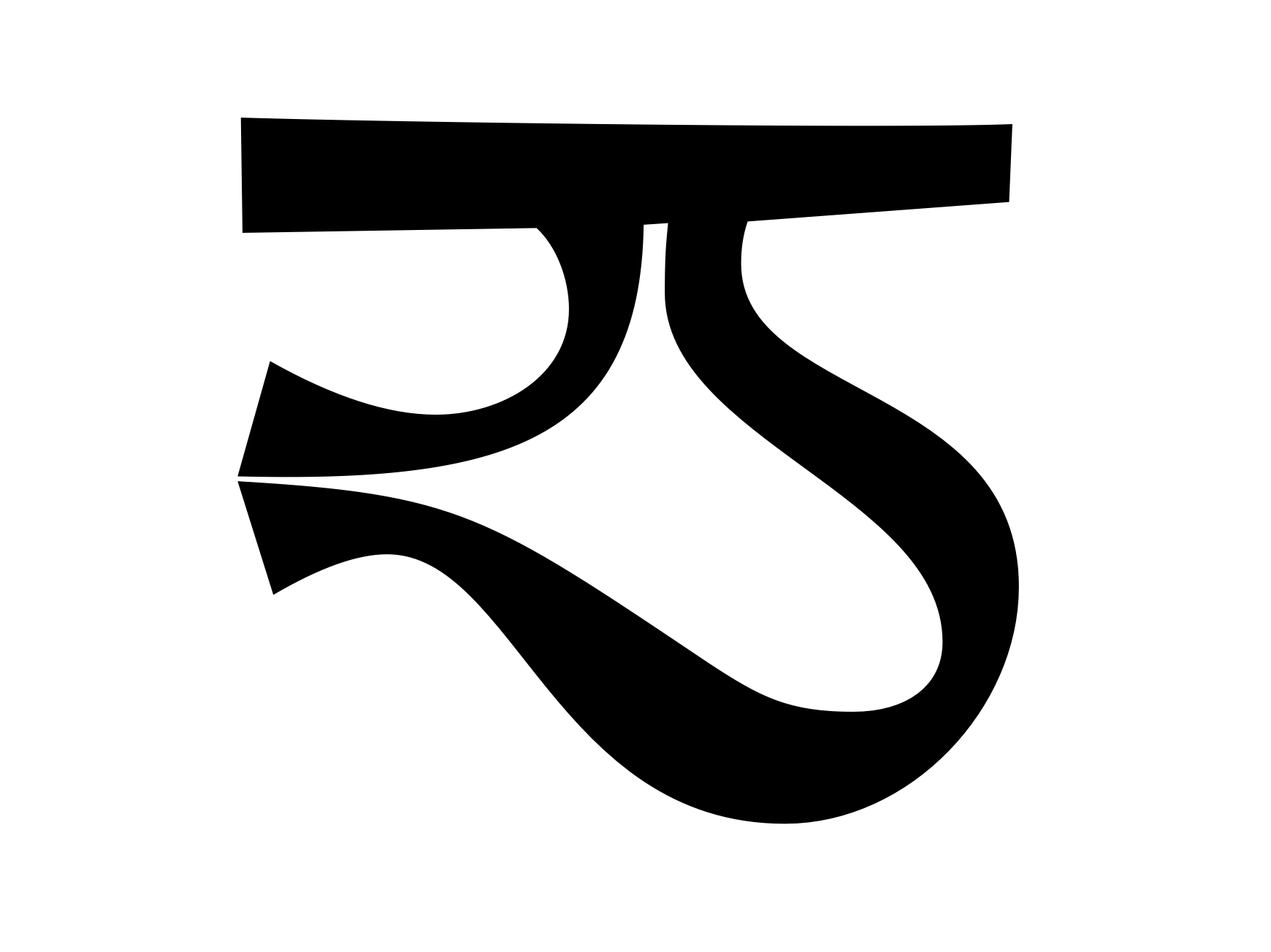
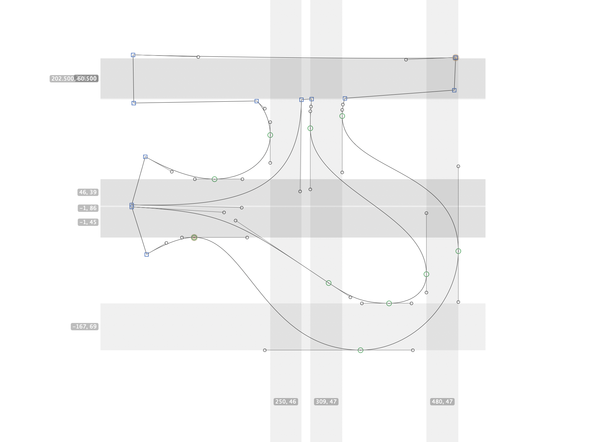
A Reverse-Stroke Tibetan Type Project. Born quirky.
一款逆反差风格的藏文字体。

In 2019 I had the chance to travel around Tibet with a friend who has been a backpacker and educator. As we visit temples and learn about Tibetan buddhism, I find myself taking pictures of the typography printed, written, or engraved on the body of Tibet. In 2021, I got to learn from a brilliant typography designer Jo De Baerdemaeker at TypeSchool. To understand the visual component of a language as a designer, I also had to study Tibetan to the extent of how to pronounce each phoneme and the anatomy of each Tibetan character.
Designing a type is not designing graphics.
2019年,我与一位一直以背包客和教育工作者身份旅行的朋友一起游历西藏。我们参观寺庙、了解藏传佛教,那时我拍摄西藏各个角落的印刷、书写或刻在物体上的文字。2021年,我有幸在 TypeSchool 向字体设计师 Jo De Baerdemaeker 请教做字。作为一名设计师,要理解语言的视觉组成部分,我还不得不深入研究藏文,包括如何发音每个音素以及每个藏文字符的结构。
设计字体并不等同于设计图形。
Information takes shape. Written language takes its shape in its typography. While the age of digital publication has diminished the need of hand writing, the visceral experience of conveying a message through spatially organize a written character need not be abandomed.
This type, Untitle Tibetan, is inspired by the risk-taking strokes and vibrant curviture in Maelstrom, and evolved into a modern look that preserves certain flows of hand-written letters.
信息有形。书写语言在其字体中体现出其形态。虽然数字出版的时代已经减少了手写的需求,但通过空间有序排列书写字符传达信息的内在体验不应该被抛弃。
这个名为“未命名藏文”的字体受到了“Maelstrom”中冒险的笔画和生动的曲线的启发,并演变成了一种现代外观,保留了一些手写字母的流畅特点。


